Slussen V
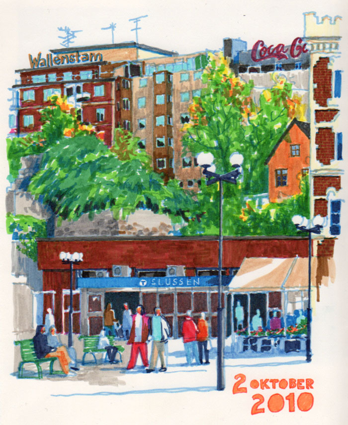
I went drawing at Slussen again yesterday, trying out my spankin’ new Faber-Castell Pitt Artist pens. These brush tips are not anything like my usual drawing tools. I didn´t like these at all before, until I started trying out more of a painting approach – then the fun begun. Fun enough to buy a pack of 24 colours.
Not having a firm fine tip to draw with is really something else, you have to concentrate on surfaces instead, shapes of colour instead of lines. A challenge indeed, but a fun one. Also, the colours are not at all like the ones I would have mixed in watercolours. Here I have to choose – do I want beige or do I want orange? Because I can´t really mix them or choose a halfway ‘orangey beige’. This of course makes the colours a lot brighter than I´d like, but this too is a fun challenge. You know, just getting out of my comfort zone for a bit.
18 x 22 cm, Faber-Castell Pitt Artist brush pens on Arches Satinée 300 gsm watercolour paper.


Very strong sketch! You can’t see any uncertainty or hesitation here at all – one would never know that this is a new manner of sketching for you.
Wow! It’s beautiful! Love how the colors pop up. Agree with Dan – wouldn’t have guessed this was new to you.
Beautiful! The colors pop and the energy of the markmaking shows your enthusiasm.
Interesting, I like the feel of the brush pens but have difficulty with the colours. You managed to make a great sketch with them.
I have some, too, and I don’t like them much….. But – if I could do this with them, I’d adore them, I’m sure! The energy and vibrancy of this piece is wonderful! nancy
It looks like you feel confident outside your comfortzone. Vibrant and lively!
Bright and lively ! Great job!
Ooooh Nina, you are an inspiration. I have several of those pens, but haven’t tried anything nearly as complex as your sketch. Now I feel challenged, and by golly, I’m going to get them out and try them. Thanks for showing us what can be done.
Sounds great, Virginia! And it feels great to be an inspiration to you. : )
I would never have guessed this was out of your comfort zone, even though the colors are brighter and more intense than your usual work, but still full of energy, vibrant and cheerful. I hope you paint some more with them and post them to share with us.
Joan
Gorgeous work Nina. Love the watercolor drawing of Sleussen that you did just before getting drenched from a rain shower. The Faber-Castell brush pens have a different feel for sure, your colors look super charged, but you can dampen the color if you’re not working on an absorbent paper like watercolor sheets, by immediately blotting or wiping the page. Helps if your sheets have sizing in them. I do like the marks that are left by the pens as water colors can often have that diluted, lacey feel. Again, I work on ledgerbooks so I move the pigments around quite a bit before they dry. And, as you’ve most surely discovered, if you let ‘em set up,more than 3-5 minutes, you can drop the next layer on top with disturbing prior work much if at all. I’m also involved with UKS, see you in Lisbon. Cheers, Don
Thank you so much for commenting, Don – great advice here! I have watched your videos, so I´ve seen how you work with the brush pens (and what work you do – I´m in awe!), and I can see how your ledger paper must allow more moving colours around than my sketchbook. The tooth of my paper actually wear the pens out a bit, but hey – there´s a factory making new ones as I´m writing!
Though it is great to use them anyway, and I did layer them quite a bit. I´m really enjoying the broad lines I can make with them too, as a contrast to my usual fine nibs!
It is brighter than your normal work, but it still has the Nina-factor to make it great!
Thank you everyone, you sure are encouraging! : )
Beautiful work!